Start With the Black You Want to Keep
The basecoat is the look. Paint the armor in a solid black, keep that pot on the palette, and plan to return to it whenever a highlight spreads too far. That single habit keeps the armor visibly black while still letting you place readable panel highlights.
The FauxHammer Black Templars tutorial shows one working version of that idea: Abaddon Black as the base, Dark Reaper along the edges, Thunderhawk Blue on more selective upper edges, and Fenrisian Grey only at focal corners. That is the author's example palette, not a required shopping list or evidence of our own testing. The tutorial's white primer serves its white shoulder pads; it is not a requirement for every black-armored model.
Choose Neutral or Blue-Black Highlights
Highlight color sets the character of the armor, but the result depends on context. Surrounding colors, the room's light, and the rest of the paintjob do much of the work, so a neutral progression is not automatically the worn option and a blue-black one is not automatically the polished option. A blue-black progression tends to pick up cool reflected light, while a neutral grey one tends to look plainer and more utilitarian. Both follow the same restraint: dark first, lighter second, palest last.
Look | First edge pass | Second edge pass | Focal corners |
|---|---|---|---|
Blue-black | Dark Reaper | Thunderhawk Blue | Fenrisian Grey |
Neutral | Eshin Grey | Dawnstone | Administratum Grey |
Treat the rows as starting points. Your surrounding colors, the model's scale, and the finish you want should decide how far up the scale you go.
Apply the Highlights in Three Passes
First pass: define the edge
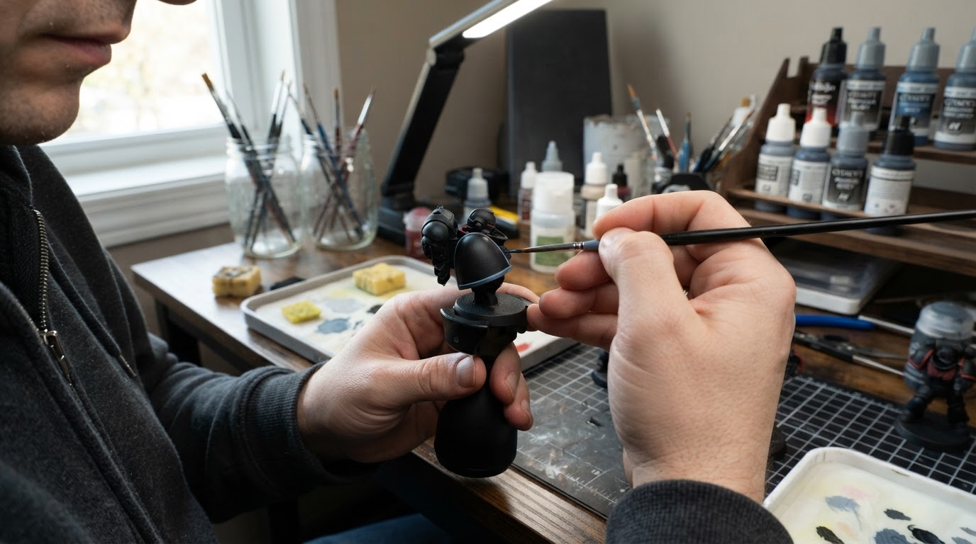
Load the brush lightly and use its side rather than the tip where the geometry allows. Run a thin dark blue-grey line along the edges you have chosen. Cover the full length of the edge, but do not let the line spill onto the flat panel.
Second pass: narrow the light
Move one step lighter and paint only the edges that face upward or catch the room light. Keep this line thinner than the first, and leave the lower edges alone. This pass is what creates the illusion of a hard, lit surface, and it is where most of the restraint has to happen.
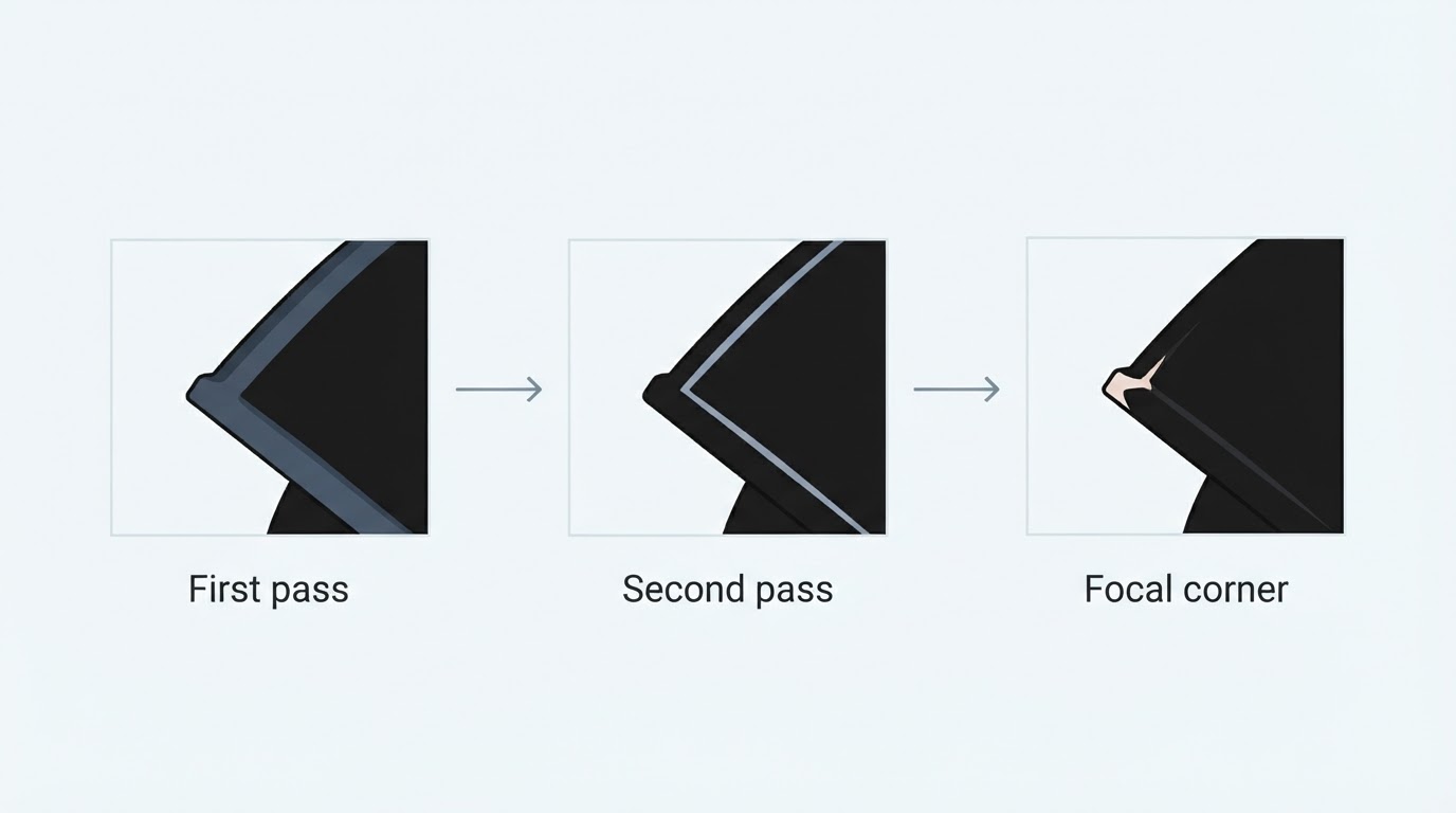
Third pass: mark the focal corners
Use the palest tone sparingly on the sharpest corners, the top of a shoulder pad, or a helmet crest. A few small touches are enough. The third pass should cover far less edge than the first.
Fix Grey That Has Spread Too Far
If a highlight looks chalky or too wide, let it dry, then tidy it with the opaque black basecoat. Load a fine brush with the black you started with and paint a thin line back along the flat side of the grey, covering the outer part of the highlight and leaving the edge itself intact. Work in short sections and check the width at arm's length before continuing. If you cut the line back too far, repaint the highlight.
A thinned black glaze can darken the grey and blend it into the panel, which softens the transition and can make the edge look less chalky. A glaze does not, by itself, guarantee a narrower physical line: the width comes from painting opaque basecoat over the excess, not from the transparency of the layer on top. Glazing first and calling the line fixed tends to leave the same footprint, just a little darker.
If the surface reads grey rather than black, the highlighted area is probably covering too much of the panel. Pull the edge back toward the basecoat, leave the flats alone, and check again at arm's length. The armor should still read black, with the lightest line taking up a small fraction of the total edge.
If you are still choosing an overall approach, the guide to miniature painting styles explains how box art, grimdark, and other finishes treat light and edges differently, which helps you judge how far to push the highlights for the look you want.