The four-pass order, and why it works
Worn leather is not a color. It is a record of where the surface has been handled, folded and scraped, and that record is easiest to paint from dark to light in four passes: dark base, stippled wear at the rub points, selective highlights, then an optional glaze to bring the contrast back down. Get the order right and the material reads at arm's length; skip to highlights and the leather looks like smooth plastic with bright lines on top.
If you are choosing an overall approach before painting details, the site's miniature painting styles guide covers broader styles. This page stays with one material and one texture problem.
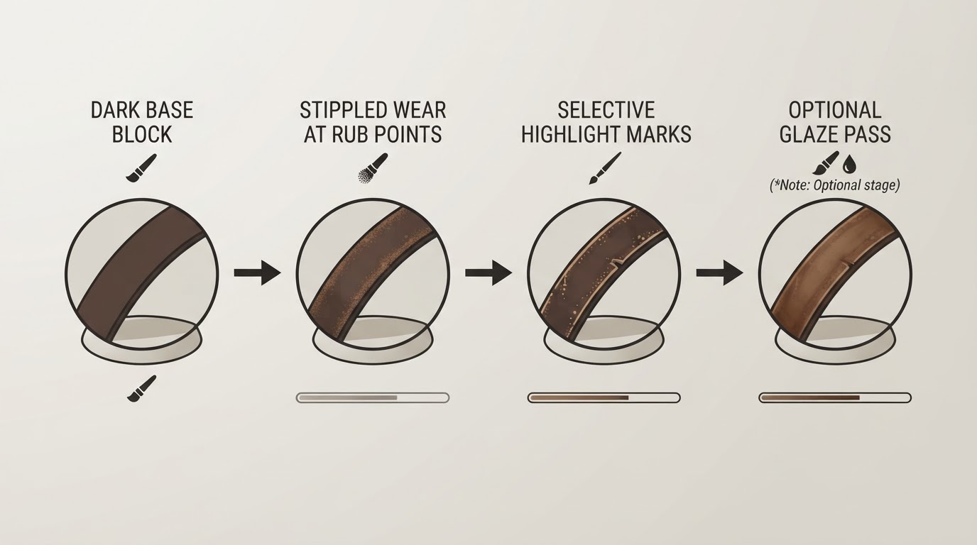
Leather wears in spots. It lightens where it contacts buckles and gear, develops worn lines where it folds the same way, and takes scuffs on the surfaces that face the light. Copy that pattern instead of adding texture evenly, and the result looks used rather than speckled.
Start darker than feels right
Wear marks are lights, so they only read against a base that is dark enough. A near-black brown, a rich dark chocolate or a warm charcoal brown suits most brown leather. For black leather, keep the base close to true black instead of a flat mid-grey; the highlights and the stipple marks carry the shape.
Work in thin coats. The quick tutorial at Heresy and Heroes blocks the whole area in a dark brown, then returns with the same color from the pot on the areas that catch light, deliberately uneven rather than perfectly flat. That unevenness becomes part of the worn look later. An all-over dark wash follows, applied a little more liberally than on cloth, to deepen the recesses. On leather the wash should stay controlled: leather is a smooth, fairly stiff material, and the shadows read as folds and creases rather than as soaked-in grime.
A generic color family is enough:
- Base: near-black brown, dark chocolate or charcoal-brown.
- Mid-tone: warm mid-brown, or a warm grey once the leather turns black.
- Highlight: desaturated tan or bone. Avoid a bright cream.
You do not need a named brand's exact pot. Creative Twilight points out that the same stippled-lighter-layers method works with lighter browns, grey and black, because the technique does not change with the color. What matters is that each step stays in the same family and only the value moves.
Wear only happens where leather rubs
This is the part that separates worn leather from speckled leather. Real wear has a cause: contact. Put marks where a strap passes through a buckle, where a pouch flap opens, where a boot flexes at the toe, where armor plates or a weapon rub, and along the folds that repeat in the same place. Surfaces that never touch anything should stay close to the base color.
The application is stippling: small stabs of paint rather than a smooth brush stroke. Load a worn brush or a scrap of sponge, wipe nearly all the paint off on a paper towel, then dab or stab it onto the leather. Creative Twilight's worn-leather walkthrough builds the effect in light passes on raised areas and lit surfaces, and switches to a fine detail brush in tight spots such as straps and boot leather. Short hatch marks can stand in for the fine lines leather picks up where it folds or brushes against other gear. Clean the detail brush promptly after stippling; see the site's brush-cleaning guide for routine care.
Two rules keep the marks believable:
- Keep them irregular. A repeating pattern reads as decoration, not damage.
- Stay off the recesses unless they actually catch light. Not every recess is a shadow, and darkening one that faces the light flattens the fold.
Build the wear in two or three light passes
One stipple pass with a light color looks like dust. Real wear is a range of damage: a broad softened zone, then tighter scuffs, then a few sharp hits on the most exposed points. Move from the mid-tone to the lighter tone in small, deliberate marks, leaving some of the previous layer visible. Go lighter with each pass and smaller with each step.
If a pass goes too far, stipple the base color back over the bright spots. Creative Twilight uses exactly that correction and warns that it is easy to go overboard; the fix is easier than stripping the model. The same source's second route, drybrushing with very little paint and a light wrist, produces a softer mid-tone on larger areas such as coats and cloaks.
Heresy and Heroes reaches the same place with a very dry, swirling drybrush for the mid pass and a more conservative second drybrush only on the raised, light-catching highest areas. Either route works. What matters is that the brightest marks are the fewest, and that each pass covers less area than the one before it.
Selective highlights finish the read
The final highlight is not an edge highlight on everything. It goes only on the most exposed points: the top edge of a strap, the crease peaks along a boot, the corner of a pouch flap, the tip of a buckle tongue. Keep it off the abraded zones you just built, because those are already lighter and a bright line there flattens the effect.
A hairline of desaturated tan on the very top edge is often enough. If the leather starts to look polished or clean, the highlights went too broad. Worn leather is dull; Heresy and Heroes frames the goal as avoiding shiny black or clean brown leather, and the four-pass order is built around that same constraint. Bright highlights belong on the few points that genuinely face the light, not along every edge of the sculpt.
The optional glaze that ties it together
After the stippled layers, the contrast often reads too strong. An optional glaze pulls the surface back together. Mix a thin glaze from your base color and plenty of medium, then glide it over the whole leather area. Creative Twilight suggests roughly four parts medium to one part base color and describes the goal as tinting rather than washing: the glaze softens the transition between the base and the bright marks so the scratches look embedded in the surface instead of drawn on top of it.
If you prefer a warmer finish, a thin sepia wash over the whole area does a similar job. That is where the Heresy and Heroes sequence ends: a final sepia coat over the completed drybrushing, after which the leather is done. Either way, apply it once and step back. Worn leather has lower contrast than most painters expect on the first pass.
Where to put the wear: a quick decision table
Location | What the wear looks like | Color move |
|---|---|---|
Strap ends and buckle contact | Rubbed, lighter than the strap body | Mid-tone stipple, then a small highlight at the contact point |
Pouch flaps and lid edges | Scuffed along the opening edge, dirt in the crease | Mid-tone stipple on the flap edge, base color left in the crease |
Boot toes and heels | Broad lightened zone with a few fine lines | Broad mid-tone pass, then short scratch marks |
Armor contact edges | Sharp scuffs where plates and weapons rub | Sparse light stipple only on the contact line |
Deep, repeating folds | Worn lines rather than a smooth crease | Thin hatch marks in the light tone, then glaze |
Black leather | Shape carried by highlights, not by color | Keep the base near-black, stipple warm grey, glaze back down |
Leather, fabric and metal wear differently
Leather is smooth and stiff. It creases in defined, angular folds, its highlights sit tight to the edge of those folds, and its wear is scuffing plus a few fine lines. Keep the transitions short and the marks sparse.
Fabric is woven and softer. Its folds curve, it soaks up wash differently, and its wear reads as thinning, dirt or a frayed edge rather than as scratches. Stippling cloth the way you stipple leather makes it look muddy.
Metal is a separate surface again. It shows isolated specular hits, chipped edges and oxidation, not a rubbed-lightening pattern. A stipple pass over armor steel reads as rust or dust at best, and as imitation leather at worst.
If one leather technique is applied to all three materials, the miniature starts to look like it is made of one substance. Match the wear pattern to the material first, then choose the colors.
If it went wrong: three quick fixes
- Too speckled. The marks are evenly spread. Stipple the base color back over the middle of the area, then keep future passes on the rub points only.
- Invisible at table distance. The base is probably too light, or the highlights are all in the shadow. Darken the base, then add wear only in the zones that face the light.
- Looks painted on. The bright marks sit on top of the surface. Glaze back down with the base color, reduce the highlight value, and leave more of the previous layer showing.
None of these fixes require stripping the model. Each one is a small correction pass over the same area, which is why the four-pass order leaves room for them.
FAQ
Do I need a specific paint range? No. The two tutorials on this page use a fixed set of pots for demonstration, but the method is a color family, not a product. Pick a dark base, a warm mid-tone and a desaturated highlight within the same family and the sequence works.
How do I paint leather texture on black leather miniatures? Keep the base close to black, keep the deepest creases dark, stipple with a warm grey rather than a pale brown, and let the glaze do more of the unifying work. The order of passes does not change.
Does this work on Warhammer, 40k and other systems? Yes. Straps, pouches, holsters, coats and boots take the same treatment regardless of the game system or faction. The only adjustment is scale: the smaller the leather piece, the fewer marks it can hold before the texture overwhelms the shape.
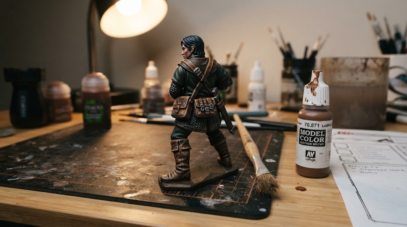
Can I stop before the glaze? Yes. If the leather already reads correctly at arm's length, the glaze is optional. Add it when the contrast looks stronger than the material should be, or when the bright marks look separate from the surface.
How long should each pass take? None of the passes is long. The time goes into placement and restraint: a few seconds of stippling, then a pause to judge the area from a normal viewing distance before the next mark goes down. Overworking an area is the most common way to lose the worn look.